

 Sean van Dril
Simple advocacy tools for pro campaigns
ActionButton is built to give people the infrastructure they need to advocate for change. In 2025, our focus was simple: make it easier for anyone,...
We’ve made a series of updates to improve how users engage with your buttons: all designed to make actions easier, clearer, and more impactful. These changes are now live.
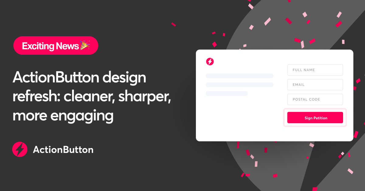
We removed distracting horizontal lines and moved the “Created by” tag to the bottom of the button — helping the call to action stand out.
We’ve refreshed the button color palette to make it more vibrant and attention-grabbing across different devices and backgrounds.

A new Copy Link option in the sharing menu and thank you screen makes it faster for users to spread your message across platforms.
Equip your supporters with custom talking points to stay on message, boost confidence, and drive higher call success. Track who the calls go to, with real-time reporting on outcomes.

Prefer a cleaner look? You can now remove the logo from your buttons.
We've updated the language “lawmaker” to say “elected officials” on the Contact Your Lawmaker button, to better support users across the globe.
We’ve removed the character minimum for opinion-based responses on future buttons. This makes the Opinion button more flexible, allowing the submission of shorter responses.
These improvements are designed to streamline the action-taking experience, so you can engage your audience more effectively and drive greater results.

ActionButton is built to give people the infrastructure they need to advocate for change. In 2025, our focus was simple: make it easier for anyone,...
.jpg)
To mobilize people, you first need to understand them. But gathering meaningful insights can be time-consuming and manual. Whether you’re organizing...
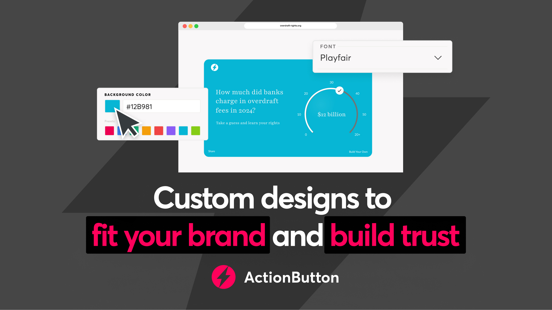
You work hard to build your organization's brand. Your digital tools should respect that identity, not disrupt it.